
Project :
For my capstone project we were tasked with creating something that we felt would improve our portfolio. The project we choose to do was completely our choice. I decided that I wanted to create a rebrand for the Ultimate Fighting Championship the (UFC) which is the premier fighting organization in the world.
My Role :
· Creative Director
· Motion designer
· Merch Designer
· Creative Direction
· Visual Design
· Composition (Audio and Visual)
The Process :
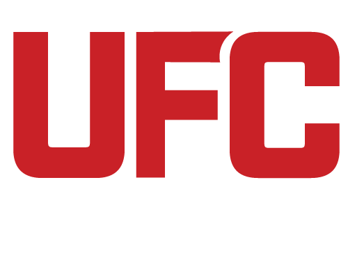
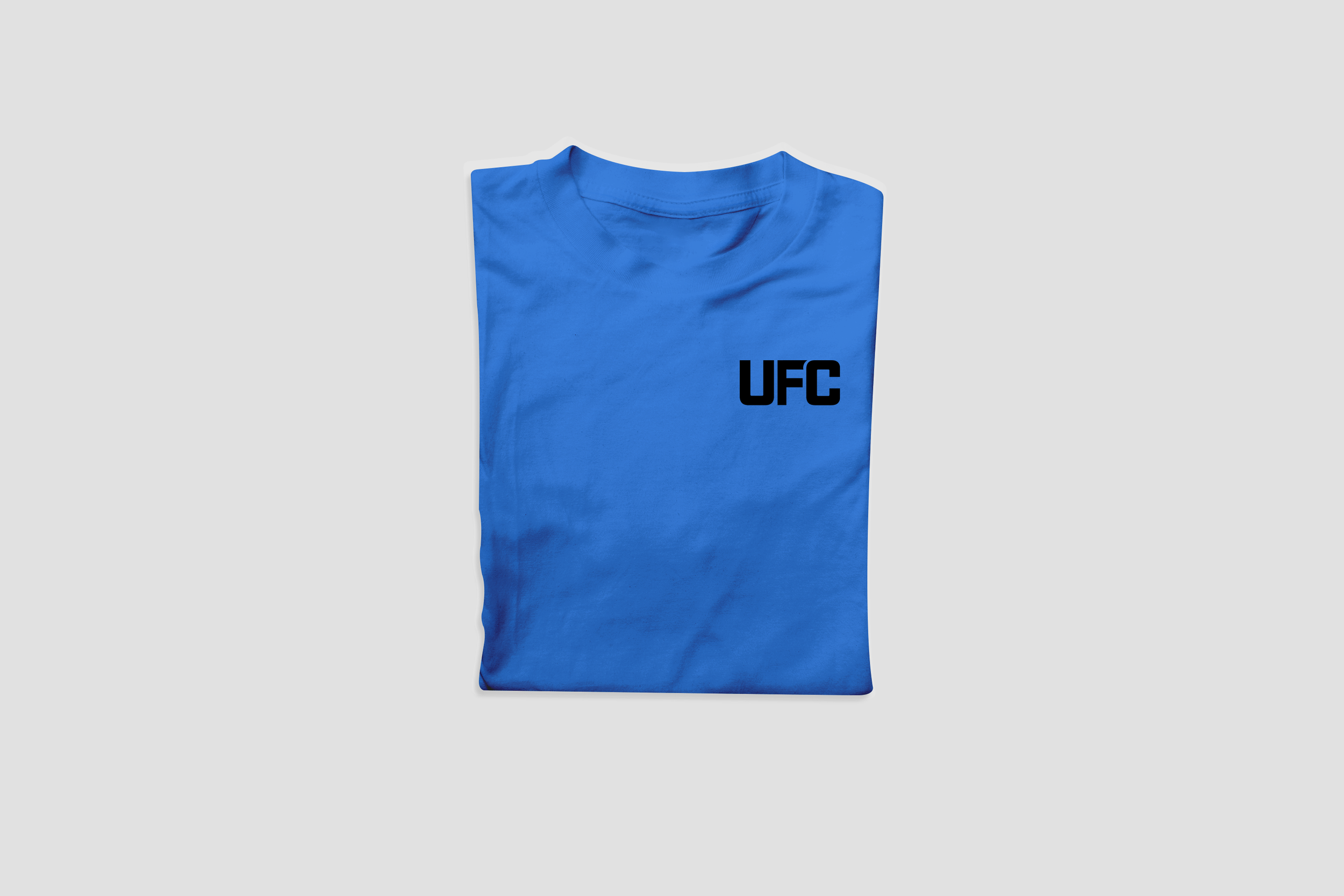
When rebranding a brand that’s so big my first thought was what can I create to make it better. I wanted to create a brand that had creativity while also referring to the color scheme. I started with still graphics such as fight posters, and social media graphics. From there I created motion graphics for TV as well as in stadium. This is where I believe I can really improve on what the UFC has my motion graphics are engaging and easy to read. From there I added sound to make the motion graphics more engaging and more real. I then wrapped up the logo I wanted to move away from the horizontal line in the F the UFC has and play with the F and C I think my logo reads better and gives more flare to the brand. As I believe for a big brand like the UFC the original logo, they have is too basic. For my merchandise I used the logo I created and had blank Tees. For events I took the posters I made put the UFC logo on the front and put the poster on the back. Honing in on giving the consumer something to remember from that specific event.
The Actual Design :
For the actual design I used a basic red, blue, and gold color palate. As I wanted to keep the branding simple the blue is for darker themed stuff the red is for lighter themed stuff and the gold is used to represent great fighters or champions. The logo I created I believe is better than what the UFC has right now they have a diagonal line in the F and that’s all I wanted to give the logo more flavor I did this by taking the F and the C and rounding the corners so that they fit together. I think it gives the company more flare than the original logo. For my fight posters I used creativity and took inspiration from where the specific events I choose were located, specifically the events were in New York and Miami. I also used my own creativity not following the brand guidelines as I feel with so many different fight posters following the brand guidelines would become boring. For my motion graphics I wanted to create, and Arcady feel to them. I wanted the fans to be engaged while also give the motion enough time for an announcer to speak over them. I used a lot of flicker effects and 3D motion backgrounds to give the feel of a big event. I used sound that I felt fit the motion for example I used crowd noise and the tale of the tape song that the UFC uses. For the merchandise I created I wanted to create something that consumers can take away so for the fights I created merch that aligns with that specific fight card I put the posters I created on the back so the consumer can remember the shirt as going to that specific fight card.
Logos


Brand Guidelines

Fight Posters


Social Media Design Templates


Motion Graphics for Jumbotron and TV
Stadium Signage


Jumbotron Mockup

Merchandise


*Just a disclaimer all video, photos and audio are all copyrighted material. I do not own the rights to any of it. This project is for my personal use only.